Presentation Process; Film & Documentation
 After roughly testing the possibility of filming the book (to be uploaded) work progresses in producing a high quality film presenting the book and its various levels of interaction and depiction of phonoaesthetics. Quality and shot dynamics are obviously paramount within the process, but the communication of content is evidently just as important. The film aims to be both informative, but beautifully shot, capturing the balance between aesthetics and user understanding.
Final Publication; Images Continued
 Shown are two further spreads (8-9 and 14-15). The first details Serialism and Fouyaka's advances in phonoaesthetics, looking at the relationships between shape and composition. Using various forms (shown is a triangular approach) he drew various compositions using repeated forms, and then translated lengths to tone and frequency, as the interactive printed elements also do. The base length of the triangle determines the frequency of the noise listened to.
 The second spread relates to sound source, and the initial positions that sound comes from. Using a left to right composition, the interactive elements and sounds also pan from left to right, allowing the user to observe the relationship between sound source and location.
Final Publication; Images
 Shown here is the final front cover, and spread 8 from the final bound book. Printed on a 120 gsm splendorgel stock, with 65% silver conductive and 35% carbon conductive inks using both screen and digital processes, the book is fully functional as an interactive and informative publication based around phonoaesthetics.
 It details various forms of the topic, but enhances understanding and experience of it through a phonoaesthetic experience within itself; using the medium to allow the print to be listened to and understood on a more relevant sensory plane. As
various elements of the print are touched using the master sheet, connections are made allowing the designs to be listened to through the circuitry in
place, both on and off the page.
Final Circuits; Last Check
 As the book is finished, the circuitry and connections to the main control unit are to be closed up within the bind. This means checking the final circuits and PCB fabrication against the schematics, to prevent problems once the book is fully complete. Tests are to commence using all elements of the project making sure everything works correctly within the interaction and design of the final book.
Finishing Process; Final Bind

Shown here are the final applications of the binding, and presentation box. The cover is being affixed to the bespoke hollow bind, and the breadboard is being placed within the book box for obvious aesthetic and practical reasons.
There will be a 50cm ribbon cable attaching the book to the circuit boards, allowing for use and tangibility within the interaction. The binding of the book is approaching its end, and presents just simple testing and quality control elements left to complete.
Finishing Process; Foil Block
 Shown here is the positive for the foil blocking of the front cover. Fabricated through Metallic Elephant, it is an 8 gauge sheet, allowing for a quality indentation on the grey board cover. Using the bespoke typeface for the project, the design is purely type based, utilising the tactility of the grey board and juxtaposition of the internal spread designs.
Beginning of Binding; Fabrication
 The binding of the book has begun - but is proving very difficult. To interweave both a tangible book design, and a circuit with more than 40 outputs, a main control page, and numerous peripheries is very diffcult. This has resulted in a bespoke bind, using an exaggerated hollow within the spine, combined with a french spine binding, using both book binders twine and the wires from within the circuit to do so.
Coding Print; Electrical Ink
 I have begun the final coding of the print; an odd concept in itself. Directing electrical impulses around paper has proved to be a fascinating way to approach the medium. The ink allows for the computer to control the paper, and vice versa.
Adobe Director; Coding
 The coding for the interactive print is to be completed on Adobe Director. Whereas this is an old and somewhat 'traditional' coding method, I am familiar with it, and can easily do what needs to be done in connection with the conductive ink, with the help of Matthew Falla. The software provides an interface for the inputs (the touchable hotspots) and allows me to control the outputs for such.
Interactive Print; Trials
 Shown here is one of the first examples of the connection between print and electronic information that I have attempted, it is providing the basis for the prototype of the book, using the master sheet as shown to navigate the pages and understand the content.
 These trials have been allowing the user to 'listen' to the conductive ink, making connections and using the resistance within certain circuits to provide sound.
Final System Design; Implementation
 Using a breadboard (as shown) I am beginning to manipulate circuits and experiment with the ways I can utilise the conductive ink, finalising the design, and using a master sheet to allow the user to listen to each printed sheet.
 The process while complicated, is somewhat effective in it's use, providing interactive, but informative results within the use of the printed medium.
Printing; Pelefort Press Continued
 Shown here is a printed spread - the conductive ink acts as an arbitrary but welcome design feature, the silver proving to be effective; seeming to be like a metallic pantone.
Printing; Pelefort Press
 The spreads have been sent to print - at Pelefort press, a screen printing studio in Brixton. The conductive ink needs to be printed using this process, and although slow and time consuming, allows for a variety of inks to be used (such as the conductive ink) that simply cannot be found in litho or digital processes.
Schematics for book; Completion

The schematics for the book, after being checked off, are now completed - and are both technically correct and still relevant to my concept and design. They are ready for print using the electro conductive ink via screen printing.
System Design; Progression
 The circuits and schematics, including the software for the programming are now complete for the book - the design of which has allowed me to realise the relationship that will evidently be present within the publication, between aesthetic and electrical effectiveness. For example, the line work within all the conductive circuits has to be 1.5 mm, a design stipulation over visual choice which will evidently feature in the book.
Design Development; Interaction
 Some of the spreads have shifted from a less abstract to a more Tufte inspired mapping of information. Shown is a recent design for the book, mapping frequency visually, evidently a link phonoaesthetically, the relationship between accountable sound data and it's aesthetic appearance is something to be explored and understood within the project.
Systems; Coding
 In order to create a book to be a book printed in conductive ink which would produce sounds, evidently, each page would need a control in order to allow processing and data to be handled easier. Shown is a coding system for each page, to allow the chip controlling the sound output to recognise each page it is on. It uses four bars (providing 15 combinations and so 15 pages) to differentiate which page it is on.
Systems; Design Development
 This week I have begun work on the coding and schematics for the project with the help of Matthew Falla. Pictured is my desk at the studio where I have been working. The design sheets are continuing to develop, as are the systems which will control them.I have ordered the electro chromic ink which is due for delivery in order to continue with fabrication plan.
Design Development
 The design stage of the project is evidently well under way, as is consideration of final output for both the hand in and the show. As fabrication deadlines loom, I have begun to develop designs to their final output. Shown is a spread based on Cornelius Cardew, a composer who produced shapes instead of musical notation - the ink will allow the user to 'listen' to such shapes.
Final Concept and Materials Test; Development
 After the meeting with Matt, the designs have been finalised, and the fabrication of the book begins this week. The book itself is to be fully printed in conductive ink, allowing the user to listen to the printed matter - a book about sound and image, in which you can 'listen' to the print using the resistance of the printed medium. Pictured here is the materials mock up for the final book (obviously the cover design is not present). It is quarter bound with a greyboard hardcover, noir book cloth, and the front cover is to be foil blocked in black.
Matthew Falla; Fabrication
 The end of this week saw another meeting with Matthew Falla of Osmotronic, discussing the final movements to be made towards production. The schematics for the design have been drawn up for Matthew to check before they are printed, including the circuit diagrams for the entire book, the cover, and the chip for sound processing. Shown is a simple system which analyses the current drawn in pencil (containing graphite) between two live bus bars of conductive ink, producing varying sounds built on this resistance.
Mapping & Illustrations; Development
 Shown is a spread in development, which although the circuit is not shown in the screen grab (the schematics are still to be checked) the design is shown. This spread maps the first visualisation of sound, illustrating Pythagoras' rules of harmonics - the sounds produced will obviously correspond to the concept.


Grid System; Design
 Shown is the first grid for the book, pictured on the right are the conductive contacts, these can be added and subtracted as necessary for each design and page layout. In the top right hand corner is a coding system, allowing for the programming system to recognise each page separately.
Matthew Falla; Development
 Pictured is a list drawn up in the meeting with Osmotronic; the items circled in green need to be complete asap to begin with the fabrication and programming of the book. This includes finalising designs, user interaction, and the master circuit board; all to be printed in electro conductive ink to allow for tactile interaction.
Matthew Falla; Contact
 Matthew Falla is an RCA graduate, and runs a studio called Osmotronic. He has pioneered various interactive print methods, including the posters shown here. I have been for a meeting with him, and have discussed the options of producing a book which you can 'listen to'. As opposed to the ink reacting to sound, the ink will produce sound. Matthew has expressed interest in helping me produce the book and also with the programming of the object.
Hudon-Powell; Communication

After having trouble with the fabrication of an EL book for nearly a week, and problematic suppliers, I feel I will be wasting valuable time using the medium. Hudson-Powell invited me to their studio to discuss the project and the various other possibilites, and provided me with alternative options, and a fresher perspective on the project. Suggested was the option of inter-graphics (something referred to in various class discussions, and on Dani Matthews' blog) and provided me with contact details of RCA alumni interaction and design, Matthew Falla to pursue the possibilites of such options.
Delivery; Development
 I have had an EL panel delivered inorder to deconstruct it, and see if it is a viable option to be placed within a book. The first problem arises in it's coating; the way in which they are commercially used, means they have a graphic overlay, effectively masking the light. This would firstly be too thick to sit nicely within a book format, and also provides a gloss which would prevent tactile flow. The EL panels also I have found out, cannot be printed onto specifically chosen substrates, again a problem for my design.
Electroluminescent Panels; Development
 EL panels are a technological medium, rarely utilised within design. However, famously championed by Troika in their T5 installtion (view it here) the possibilites of such a process are wide. The ink, which illuminates when current is passed through would allow for the project to be realised efficiently. I am currently in talks with Olmec, a producer in Sheffield who are interested in the project, and have requested designs to begin the production process.
Fabrication & Production; Development
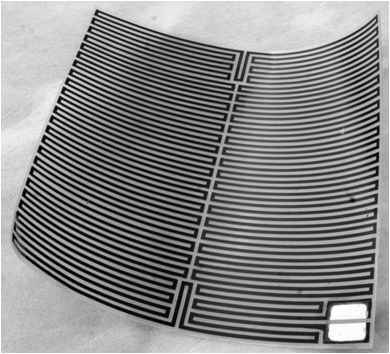 To produce something which is technically viable; much research has gone into the fabrication methods of producing a book which allows user interaction and sound as a medium. Pictured is an element I ordered for a first test, using thermochromic ink, and flexible printed heater pads to sit in between pages - which would use a sound inverter to activate various temperatures. Whereas the heat allowed for the thermochromic ink to activate and change colour, the time that it took to cool back down (i.e. deactivate) was not immediate - and with sound as an immediate medium, the book would present a 'lagging' aesthetic.
 Type Face; Design
 For use within printed materials, Phono Sans is a mono face designed for headers and titles. Taking inspiration from the various lino type mono faces, it is utilitarian but can still provide 'tone' when applied correctly. The face will be used for certain elements of my printed outcomes within the project. It is downloadable from here in a TTF format.
Final Outcome; Concept
 As discussed in previous sessions, my final outcome for the project will take the form of a book, in which the ink reacts to external sound. (Reflecting the content and research upon phonosemantics) For the show I plan to produce two copies of the book, and a synthesiser which would create various tonal ranges to display the affects of sound upon the book's spreads.
Ideas & Concepts; Development
 While researching the nature of phonosemantics, the various possibilities of a final outcome have been progressing conceptually. The posts that follow detail the various stages of concept and production details that have been explored this week including a final idea, and the various production means that are possible and within the means of fabrication.
Visualising Sound; Research
 Mike Deal, a New York based designer here has taken the Beatles back catalogue of albums, and contained the musical elements of such within a very typically modernist information based piece of design. Simplistic but effective, the 'sound' of each album is conveyed using a diagramatic indicating the key and chords used. A very basic, but interesting take on mapping the ephemeral.
Shavian Letterforms; Research
 The Shavian alphabet (also known as Shaw alphabet) is an alphabet conceived as a way to provide simple, phonetic orthography for the English language to replace the difficulties of the conventional and non phonetic spelling of the English language.
Morse Code & Typographic Sound

Morse code is an obvious transition between sound and typography; and although somewhat simple, is a very blunt example of practical relationships between sound an type.
The Bouba & Kiki Effect; Research

The Bouba & Kiki Effect was first observed by German-American psychologist Wolfgang Köhler in 1929 in psychological experiments, first conducted on the island of Tenerife. In 2001, Vilayanur S. Ramachandran repeated Köhler's experiment using the words "kiki" and "bouba." 95% to 98% selected the curvy shape as "bouba" and the jagged one as "kiki", suggesting that the human brain is somehow able to extract abstract properties from the shapes and sounds
Plato, Sound and Typography; Research
 The first recorded realisation of a semiotic implication of human use of sound, letters and their meaning, was recorded in Plato's Symposium;
"Now the letter rho, as I was saying, appeared to the imposer of names an excellent instrument for the expression of motion; and he frequently uses the letter for this purpose: for example, in the actual words rein and roe he represents motion by rho; also in the words tromos (trembling), trachus (rugged); and again, in words such as krouein (strike), thrauein (crush), ereikein (bruise), thruptein (break), kermatixein (crumble), rumbein (whirl): of all these sorts of movements he generally finds an expression in the
letter R, because, as I imagine, he had observed that
the tongue was most agitated and least at rest in the pronunciation of this letter, which he therefore
used in order to express motion"
Colour Semiotics & Typography; Research

Christian J Fauer endeavours in his work to explore the semitiotic implications of colour and the viewers interaction with such. In his Colour Semiotic Alphabet he carried through an investigative process exploring the semantic associations of colour and the alphabet. This research was formulised into a typeface of associative colour. The process and thesis can be read here.
Edward R Tufte; Research
 "At their best, graphics are instruments for reasoning about quantitative information. Often the most effective way to describe, explore and summarize a set of data, even a large set, is to look at pictures of that data."
Tufte's book was revolutionary for the information design industry, and features numerous examples of amazing pieces of design, but also very specific critical writing of design that informs, but is also aesthetically considered - the pure communication of design is paramount according to Tufte, "the viewer is should fully comprehend the communication of whatever design is attempting to convey." This needs to be considered during my design process, in attempting to explore such a complex relationship between sound, text and image.
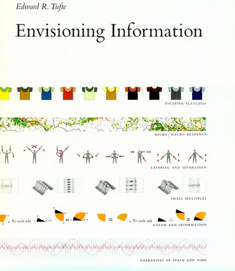
Timothy Donaldson; Research
 In order to develop a basic understanding of the representation of something as ephemeral yet complex as the visualistion of sound, in particularly with the consideration of typography, I begun to reference two books quite regularly, Edward R Tufte's 'Envisioning Inforamation', and Cowhouse's 'Shapes for Sounds.'
Cowhouse's book refers to the the direct relationship between sound and text, something which evidently I need to fully comprehend in order to realise my project. It refers to, in great detail, the developing relations between speech, technology and the alphabet, and the semantic but yet abstract relationship between sounded signifiers and the signified images they represent.
Phonosemantics; Research and Direction
 Phonosemantics, and phonoaesthetics are as previously stated, the direction and aim of the investigative and research elements within the project. Both topics, intertwined within their theory, deal with the meaning, visual representation and relationships within sound and image - in particularly phonoaesthetics deals with typography.
 Pictured on the left is a press clip of the research of Bell Labs in 1926, a very early technical investigation into the visualisation of sound and voice patterns. Here demonstrating how an acoustic lens focuses sound from a horn, the wave was made visible with an aluminum rod with a microphone and a neon lamp at the end. A complete 'sound photo' took 10 minutes exposure.
CMC7, E13B & Crouwel's New Alphabet; Research

CMC7 and E13B were the first fonts designed and printed for digital recognition. Used for such implications as receipts, early security systems and barcodes, the fonts were designed for ease within optic recognition. They were printed in magnetic ink in order to allow for scanning and digital transference of print media - a nice link between the digital and physical applications of typography.
Wim Crouwel took this notion one step further in his production of the 'new alphabet,' a digital face which played on the 'single distinguishing characteristics' of letters.
Decode Exhibition; Visiting Research
 The most popular, yet relevant exhibition to my project currently is Decode at the V&A. Featuring many projects which can be taken into consideration within the field of interaction and content/aesthetic generation, the exhibition tends to focus on the digital intervention between designer, user and the visual output. Many of pieces allow for programs and digital processes to replace traditional visual construction. Pictured is Julius Popp's Bit Code, Marius Watz' Stockspace and Rafael Lozano-Hemmer's Make Out.
Hudson & Powell Reactive Type; Communication
Hudson & Powell's reactive type is a project which focusses on another method of altering content and visuals, in disregard to the control of the the usual designer/viewer diachronic relationship. The program, using complex algorithms and programming allows for the type to create its own composition in accordance to the environment it is placed within. The aesthetic output is completely constructed through its graphic environment.
I have contacted Hudson & Powell in regards to this project to establish a time or oppurtunity where I can find out more about the project and their conceptual inspiration. See the project here.
UK Type; Communication
 After a phone call with Caroline from UK Type, I have a meeting in Birmingham on Thursday to discuss ideas for a potential live outcome in conjunction with the studio, and a path to get to such. For the next few days I will be working on a PDF presentation, which once finished will be downloadable from the blog. Research will be continued, as will the conceptual design process.
Realities United; Research

"The dynamic surfaces turn the exterior shell of a building into a communication medium, an intermediary between structure, audience and outdoor space" Realities; United
Pictured is the iconic Potzdamer platz in Berlin. 1,800 standard fluorescent fittings are arranged in a computer controlled matrix and allow for a live feed of communication between the viewer and the author. The source of the content comes from various outputs, including live displays from artists, random images from the galleries back catalogue, and live RSS feeds from the internet which can be controlled online.
United Visual Artists; Research
 UVA combine art direction, production design and software engineering to creative responsive outcomes to numerous briefs. Pictured is the set design for an 11 hour Battles gig curated by Warp, in which the position and colour of the lighting completely shifted in accordance with the music. Below is Volume, an installation at the V&A in 2006, in collaboration with one point six. There work constantly reacts to environmental shifts, and reflects these changes; whether it be sound, weather or movement, visually. The process of mapping external factors aesthetically proves to be both entertaining and intriguing, allowing for the visualisation of something abstract to become tangible